Waze gets a new brand identity, major visual changes
For the first time in many years, Waze is getting a major visual overhaul. In fact, the changes are so deep that it warranted Waze to advertise it as a “new brand identity.” Everything you see in the app now is brightly colored and .. more funnier.
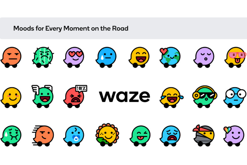
Each Waze icon has been redesign to reflect not just simplicity and optimism, but also joy. Even the angry emoticons now look kind of joyful due to the color palette and design. No less than 30 emoticons that are used to express your mood have been completely redone to come in line with the new design language.
The main elements of the new brand are based on a grid system, enabling Waze to provide users with more consistency across the board, “from product icons to social posts to email templates.” Waze is calling this “block-by-block system” and you can see in the picture below.

Source: Phonearena

Comments