Samsung One UI 3.0 review
The Samsung One UI 3.0 will power the Galaxy S21 series, and the update has already arrived to the Galaxy S20 family, so it’s time to take a look at what changes it brings and what are the new features.
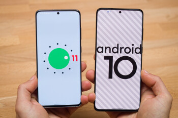
One UI 3.0 is the next Samsung interface after One UI 2.5 that was used on the Galaxy S20 family, and this update takes around 2.2GB, so it’s best to download it over Wi-Fi. There is a reason for this huge size: this new interface runs on a newer Android version, so the update will also bring your Samsung phone from Android 10 to Android 11.
Naturally, this new software brings a few features that Google has introduced with Android 11 (like the new notifications that you will see on all Android 11 phones), but also a few custom touches by Samsung that you won’t find on other devices.
Here is the list of One UI 3.0 changes:
What’s new and note-worthy
- New notification style
- Easier lock screen media controls
- New animations and smoother performance
- Double tap on home screen to lock screen, long-hold app for widgets
- New look for the Settings menu, Battery menu, Storage and others
- Consistent use of transparency and rounded icons
Let’s go through each of these changes one by one…
1. New Notification style


One UI 3.0 with Android 11 on the left phone (S20), One UI 2.5 with Android 10 on the right phone (S20+)
The biggest change that One UI 3.0 brings to Samsung phones has got to also be the biggest change that Google implements in Android 11, and that is the new style for notifications.
Visually, notifications are now separated and all appear in their own tabs with rounded edges, but not only that, notifications from direct messages now take priority and appear on top of your other, usually less important notifications. You can now also mark notifications from certain apps as ‘priority’, to ensure they appear on top of your other notifications.
2. Easier lock screen media controls

One UI 3.0 on the left, One UI 2.5 on the right
Controlling your media from your lock screen has always been a bit of a pain on One UI: the option was either hidden or in the far left corner with smaller controls where it was hard to reach.
Android 11 brings it front and center with album art and easy-to-reach controls, so you can play and pause songs, or switch to the next one easier, and that is a welcome improvement. Also, iOS users would be quick to point out that Samsung might just be copying the Apple way of doing things with this.
3. New animations and smoother performance
Samsung has also worked on optimizing the performance with One UI 3.0, and everything seems to run just a bit faster. Now, these are impressions we have after using an S20 with the update and an S20+ with the older, One UI 2.5, but the difference is not huge by any means.
Also, we couldn’t help but notice tiny bits of microlag and sttuter here and there, something that we haven’t been noticing on other devices like Google’s Pixel line and OnePlus phones.
4. Double tap to lock screen, long-hold for widgets

One UI 3.0 on the left, One UI 2.5 on the right
Two great new additions to the home screen experience is that now you can double tap on an empty spot of the home screen to lock the phone, so you don’t have to reach for the power key.
Another change is that when you long press on an app icon, you get a slightly different menu that now gives you the option to add a widget for that particular app, which is an easier way to add widgets.
5. New look for the Settings menu

One UI 3.0 on the left, One UI 2.5 on the right
The Settings menu has been overhauled and everything has become just a bit more compact and better organized.
Front and center in the settings now is your Samsung account, and further down, each tab has its own squircle icon and the tabs take up less space so it’s easier to navigate around.
Improved Battery stats menu

One UI 3.0 on the left, One UI 2.5 on the right
Also, within the Settings menu, there have been a quite a few improvements too.
For example, Samsung makes it much easier now to get a view of your battery stats in just one glance by moving battery use graphs right there, while previously, to access that data you had to dive deeper in sub-menus.
The same applies to the Storage menu, as well, and there are similar changes all throughout.
6. Consistent use of transparency and rounded icons


Notice the rounded icons in the first picture and the transparent notification dropdown background in the second
The whole interface now seems more consistent too. While previously Samsung would use icons without a background in some places, and with a background in others, you can now see the same style of icons everywhere. Samsung has now also settled on a grayish background across the notification dropdown and search boxes with a bit of transparency to it, much like iOS, we couldn’t help but notice.
Conclusion
Overall, One UI 3.0 is mostly a visual overhaul of a familiar interface.
Everything looks more consistent, unnecessary information has been removed, while what’s important has been made easier to see and access. The performance improvements are slight, but noticeable too. Overall, our opinion is that Samsung is going in the right direction with One UI 3.0, however, we do still notice traces of microlag and stutter every here and there, something that you do not notice on Google Pixel or OnePlus phones, and that’s the one area where we wish Samsung put more effort in.
Source: Phonearena

Comments